The Red theme includes a set of components that are only available on the homepage of your site. They integrate with the color and image design of your large homepage header space. These components, through the utilization of background colors and design, create visual segmentation within the homepage and allow for a visitor to recognize defined sections on the homepage. As an added benefit, they look amazing in action and all of these components support varying browser width, which is essential with the implementation of background color changes and larger image sizes within the components.
The Opportunites Home Page component provides a colorful and interactive element to your home page to highlight the opportunities your unit makes possible for the UIC community. As users hover over each circle,…
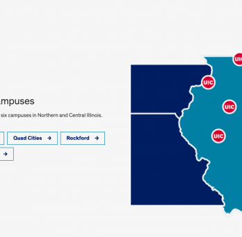
The Advanced Content Wrapper component creates a visual separation of the white background with the new content. It is an excellent way to call the visitor’s attention to a section of content by…
The Weighted Calls to Action component is useful for creating a specific “heavy” weighted link alongside other “lesser” weighted links. Again, this is a homepage-specific component that utilizes (just like the other components…
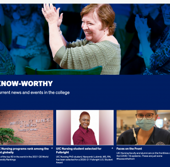
The Highlight Link List component is a wonderful way to provide your visitor a brief snippet of written content, a large visual aide, and several options to link content to engage the visitor.…
The Advanced Tab Group component (only for the homepage) can be implemented to highlight different groupings of link tiles or bits of information on the homepage; within each specific tab group, you are…
Within the Homepage, there is a “Header Call to Action” content area that will allow you to include a list of call-to-action icons just beneath the Homepage header image. These icons will…
The Timeline Component is meant to display a very wide (300px to 10,000px) image that can be utilized to display a progression in time. The Component allows for a visitor to “scroll” (via…
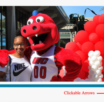
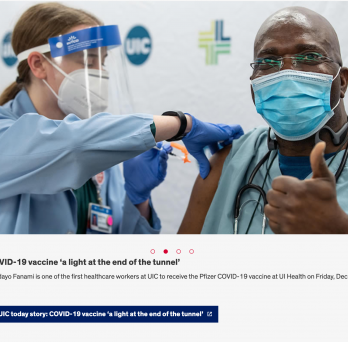
The Carousel Component can include anywhere between 4 (minimum) and 30 (maximum) images to rotate each time a visitor clicks on the “next” arrow. Please make sure that each of the images has…