Advanced Tab Group

Introduction
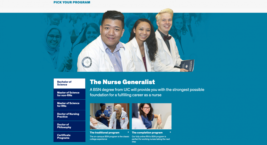
The Advanced Tab Group component (only for the homepage) can be implemented to highlight different groupings of link tiles or bits of information on the homepage; within each specific tab group, you are able to implement designated Link Tiles Components.
Similar to the Advanced Content Wrapper, the Advanced Tab Group creates a visual break from the white background of the homepage and segments the tabs (as well as link tile groupings within) from the regular content found on a homepage. The background color change expands the horizontal space within the page (or browser view) and allows for a crafty way to include different sets of interactive links on the homepage.
In the example on the right, you will notice that when a tab is selected in the tab area, only the proper link tiles (with or without images) will be displayed – all without forcing the user to leave the homepage!
Accessibility Requirements
Title Fields
Titles are required in most components to comply with the rule that headings H1-H6 must be used before a section of content to describe its context. You may select the “Hide Title” option if you don’t want it displayed; however, a site visitor using a screen reader will hear those titles. This means that titles should be descriptive and unique. If you only enter “Title,” for example, the user will hear “title, title, title,” etc. as they tab through your content blocks. They will have no context to know if that is information they should read.
Image Alt Text
Alt text should describe the image for visually impaired users who visit your website and for those whose browsers block images. The text should give a brief description of the image. DO NOT USE phrases like “image of,” “picture of,” or “screenshot of” in your ALT Text. In addition, text within the image itself cannot be read by a screen reader. That text should be included in the alt text, a caption, or other text near the image.
Link Text
Text links in your content should not use a URL as the link text. The link should have meaningful text rather than using “click here” or “read more” Instead, use the page title or a description of the page where the link leads.
Link text that is in context with the content where it is pointing gives all users better information about the purpose of the link.
Users interact with links in various ways, including:
- Screen reader users can generate a list of links and navigate them alphabetically. Redundant or ambiguous link text such as “More” is meaningless in this context.
- Users of speech recognition technology can select a link with a voice command like “click” followed by the link text. Therefore it is also helpful to use unique link text that is short and easy to say.
- Users who don’t need assistive technology often skim and scan your content, and a link that gives more context can prompt them to click through to the content they seek.
- Meaningful link text may often align with key terms or phrases used by people searching for your site. Using them for link text may improve your SEO.