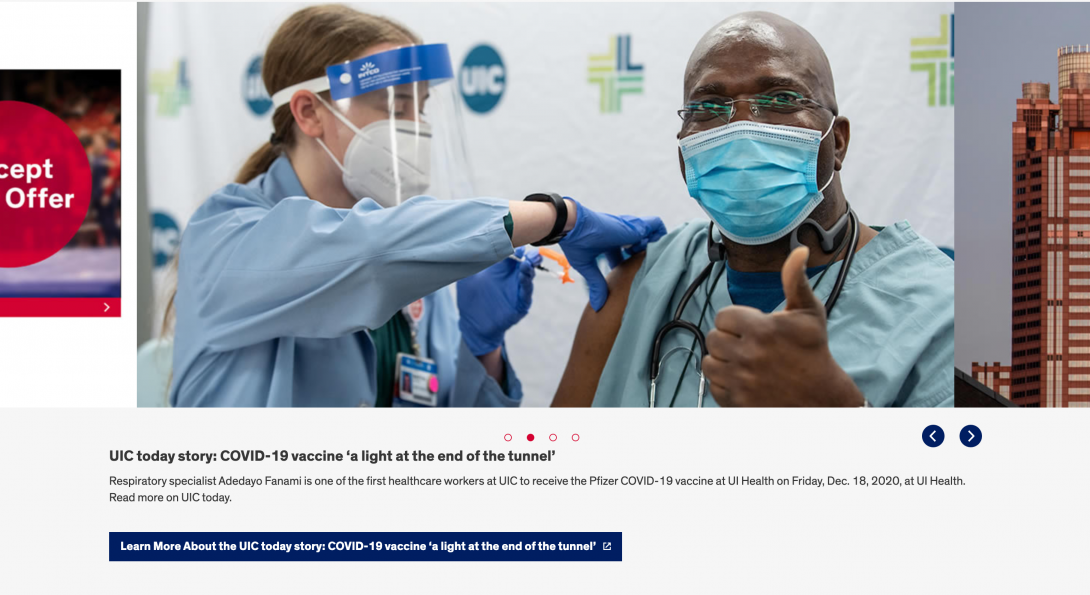
Carousel Component

The Carousel Component can include anywhere between 4 (minimum) and 30 (maximum) images to rotate each time a visitor clicks on the “next” arrow. Please make sure that each of the images has similar vertical pixel sizes; otherwise, there will be a large blank space between the “next” arrows and some of the “shorter” images you include.
There is an optional text description that is visible to visitors, and a required text area for screen readers. The required text area is not visible to visitors, but you must include descriptions of each image for accessibility standards.
Accessibility Requirements Heading link
Title Fields
Titles are required in most components to comply with the rule that headings H1-H6 must be used before a section of content to describe its context. You may select the “Hide Title” option if you don’t want it displayed; however, a site visitor using a screen reader will hear those titles. This means that titles should be descriptive and unique. If you only enter “Title,” for example, the user will hear “title, title, title,” etc. as they tab through your content blocks. They will have no context to know if that is information they should read.
Alt Text Fields
Alt text should describe the image for visually impaired users who visit your website and for those whose browsers block images. The text should give a brief description of the image. DO NOT USE phrases like “image of,” “picture of,” or “screenshot of” in your ALT Text. In addition, text within the image itself cannot be read by a screen reader. That text should be included in the alt text, a caption, or other text near the image.