Grid Component
Introduction
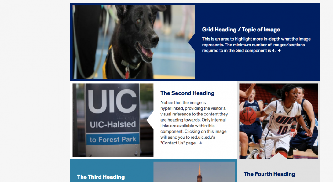
The Grid component is a framework of images with text and links to highlight content for your site visitors in a visually appealing manner.
Details on creating the Grid Component

- The image is hyperlinked. Internal, external and email links are available within this component.
- The heading and description fields should give context to the image and the content where the link leads.
- A minimum of four images is required in the Grid component.
- Another interesting feature of the Grid component is the animation that takes place when hovering over the image.
- The triangles over the images are associated with the description field entered in the editing window. It’s a way for the visitor to corroborate the words with the image itself.
Accessibility Requirements
Title
The Grid component has a required Title that can be hidden from view. It is important to understand how even a hidden title field can affect accessibility.
On a web page, section headings with large or bold text can help visual users quickly scan and understand web pages for efficient navigation. Screen readers can also scan headings, even when hidden visually.
Titles should be descriptive and must be unique within the page.
These measures allow the users of assistive technologies to:
- allow search engines to detect the page’s main topics
- understand different sections of related content
- navigate quickly to any specific section
- allow search engines to detect the page’s main topics
Image Alt Text
Alt text should describe the image for visually impaired users who visit your website and for those whose browsers block images. The text should give a brief description of the image. Do not use phrases like “image of,” “picture of,” or “screenshot of” in your ALT text.
In addition, if you use images that have text in the image itself, that text is no longer read like text by browsers or screen readers, it is seen as an image. That text should be included in the alt text, a caption, or other text near the image.
Link Text
Text links in your content should not use a URL as the link text. It should have meaningful text rather than using “click here” or “read more” Instead, use the page title or a description of the page where the link leads.
Link text that is in context with the content where it is pointing gives all users better information about the purpose of the link.
Users interact with links in various ways, including:
- Screen reader users can generate a list of links and navigate them alphabetically. Redundant or ambiguous link text such as “More” is meaningless in this context.
- Users of speech recognition technology can select a link with a voice command like “click” followed by the link text. Therefore it is also helpful to use unique link text that is short and easy to say.
- Users who don’t need assistive technology often skim and scan your content, a link that gives more context can prompt them to click through to the content they seek.
- Meaningful link text may often align with key terms or phrases used by people searching for your site. Using them for link text may improve your SEO.