Tab Group Component
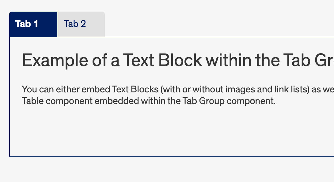
The Tab Group component is another handy way to organize extensive content on a single page. Similar to the Accordion component, you can embed several Text Blocks or Tables in one area. The Tab Group component allows you to relay several chunks of information to the visitor, without taking up too much page space and preventing that cluttered feeling of a page full of text. See below for an example of the Tab Group component in action.
Accessibility Requirements Heading link
Title fields
Titles are required in most components to comply with the rule that headings H1-H6 must be used before a section of content to describe its context. You may select the “Hide Title” option if you don’t want it displayed, however, a site visitor using a screen reader will hear those titles. This means they should be descriptive and unique. If you only enter “Title” for example, the user will hear “title, title, title,” etc. as they tab through your content blocks. They will have no context to know if that is information they should read.