Timeline Component

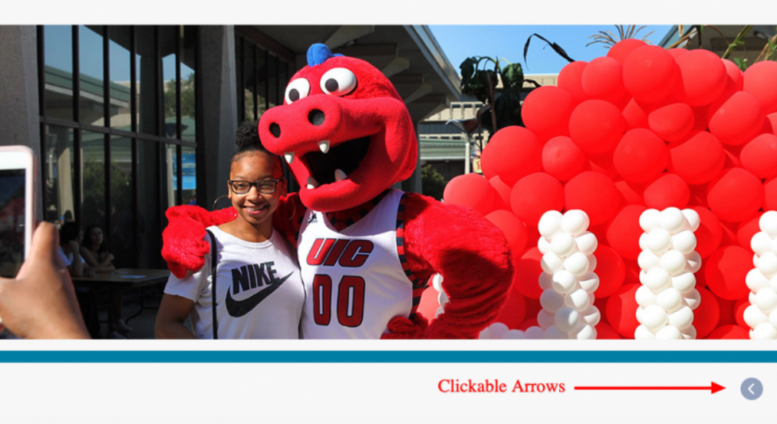
The Timeline Component is meant to display a very wide (300px to 10,000px) image that can be utilized to display a progression in time. The Component allows for a visitor to “scroll” (via the clickable arrows) as if viewing a timeline. The wider the better, when it comes to the image, as you can simulate a dynamic progression in time.
Accessibility Requirements
Title Field
Titles are required in most components to comply with the rule that headings H1-H6 must be used before a section of content to describe its context. You may select the “Hide Title” option if you don’t want it displayed; however, a site visitor using a screen reader will hear those titles. This means that titles should be descriptive and unique. If you only enter “Title,” for example, the user will hear “title, title, title,” etc. as they tab through your content blocks. They will have no context to know if that is information they should read.
Timeline Description
This required text describes the content in the timeline or graphic for non-sighted users. It should include all information that a sighted user would see in the images or graphics.